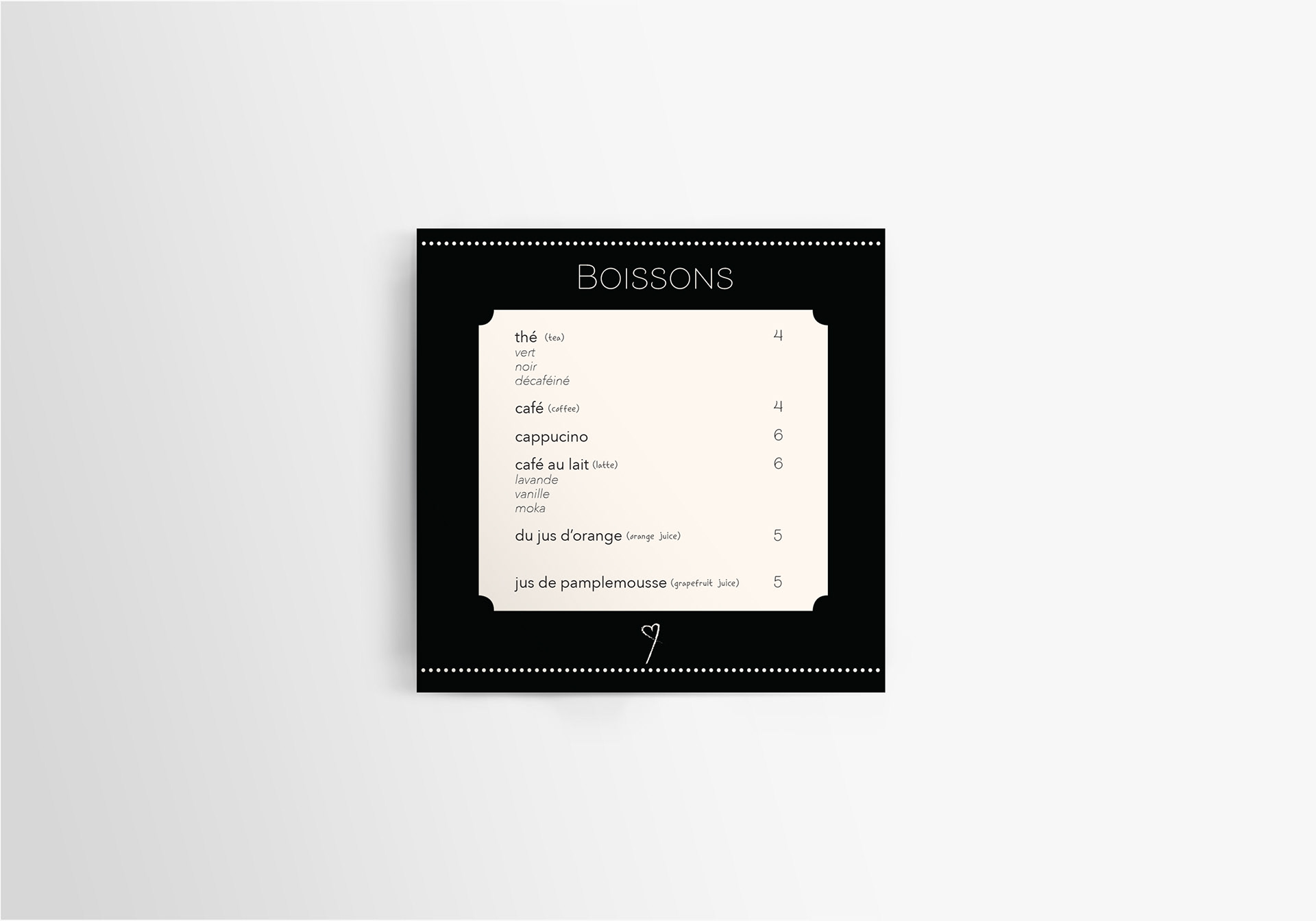
When I was assigned a menu creation project, I was also tasked with the fabrication of the restaurant itself, from scratch. We could choose anything we wanted, and I have personally always adored the vibe of smaller french bistro or cafe - type places. I thought it would be really fun to create branding for something like that, so I did.
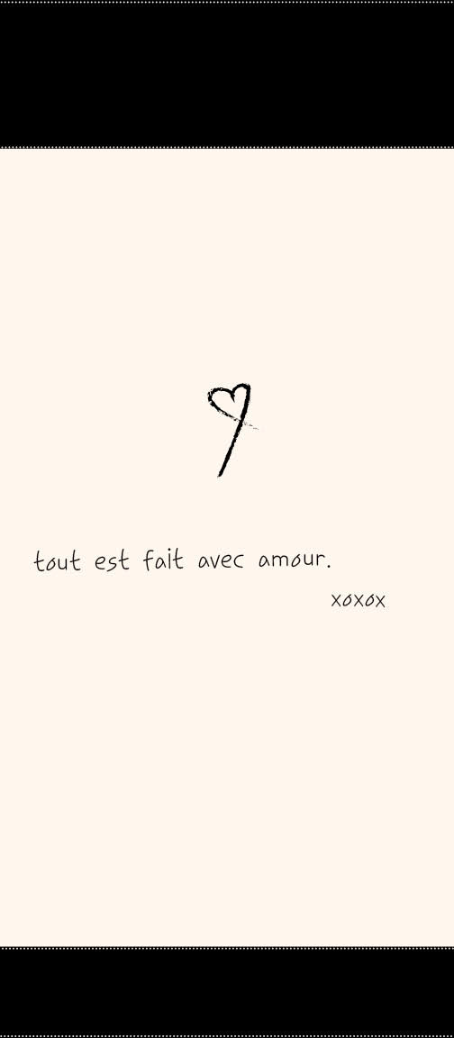
Along came “Avec Amour”, which translates to “with love” in French. I wanted to lean into the idea of a love letter (hence the “with love”), so I adhered to a black and white color pallette, with a scripted restaurant name, and hand-drawn heart logo. This also reminded me of the black and white tile floors and woven chairs I would often see in French restaurants.
I created the front and back of a traditional main menu, and then was inspired by some square shaped menus I’d seen for the drink (“boisson”) menu. You can see both below- mocked up and up close.