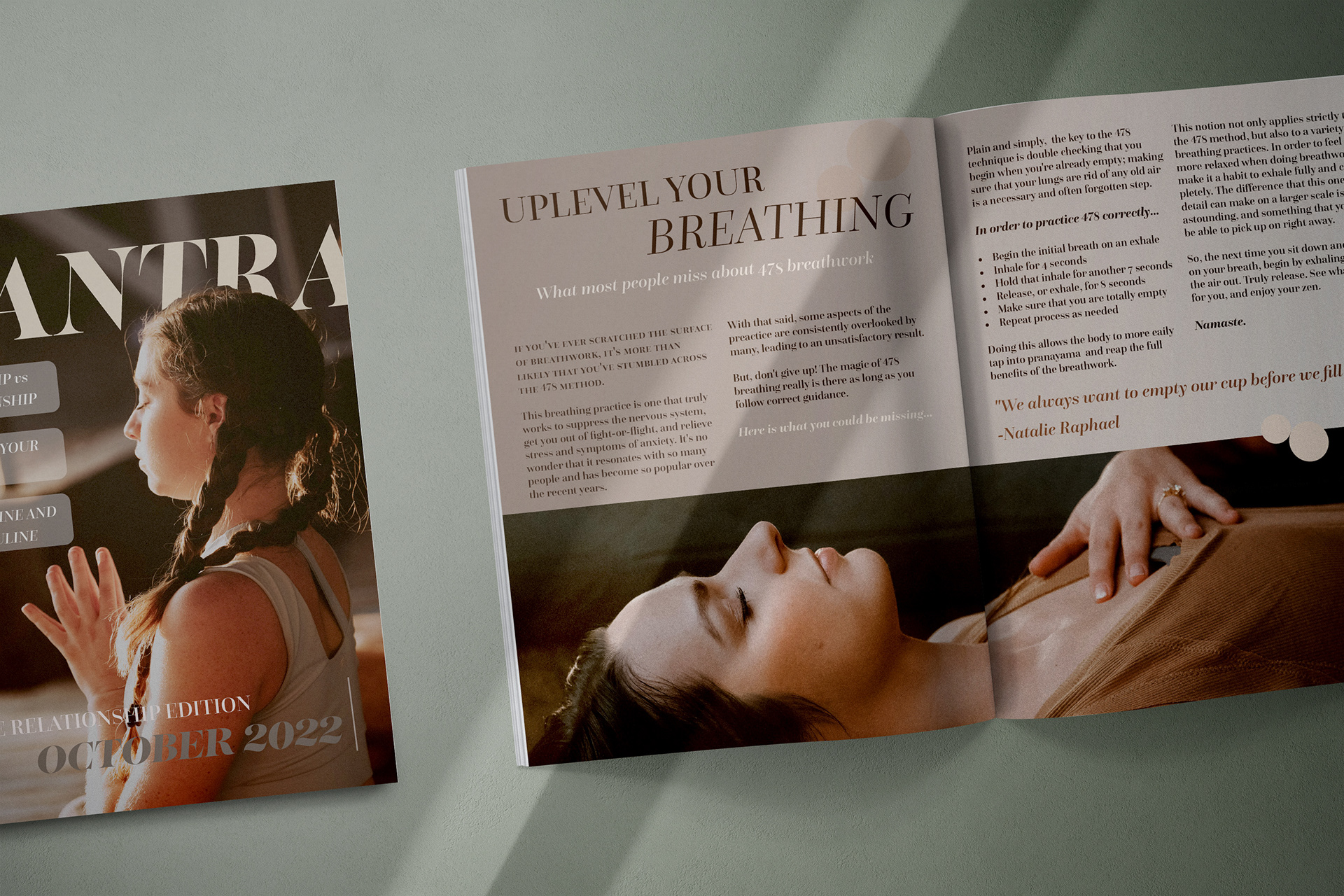
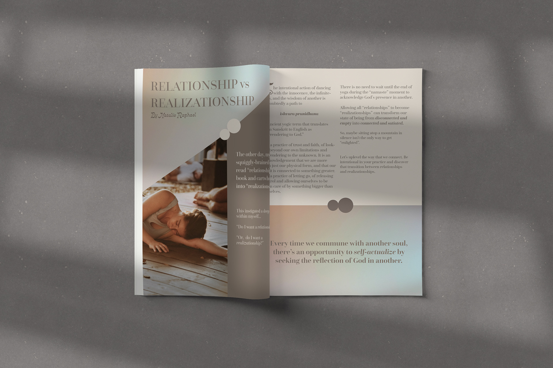
In one of my classes, we were assigned a project to help develop our magazine layout skills. We were given free reign in terms of topic, and since I was in the midst of my internship with Modern Yoga for Modern Women at the time, I knew I could access some quality material to include in a magazine focused on Yoga.
I chose to name the magazine “Mantra”, and used images and knowledge I had acquired through my internship to produce the cover and spread. This was a great opportunity for me to explore blending images and typography in a newer way, and to play around with tweaking visual language. It was also great practice working within a grid system on InDesign.


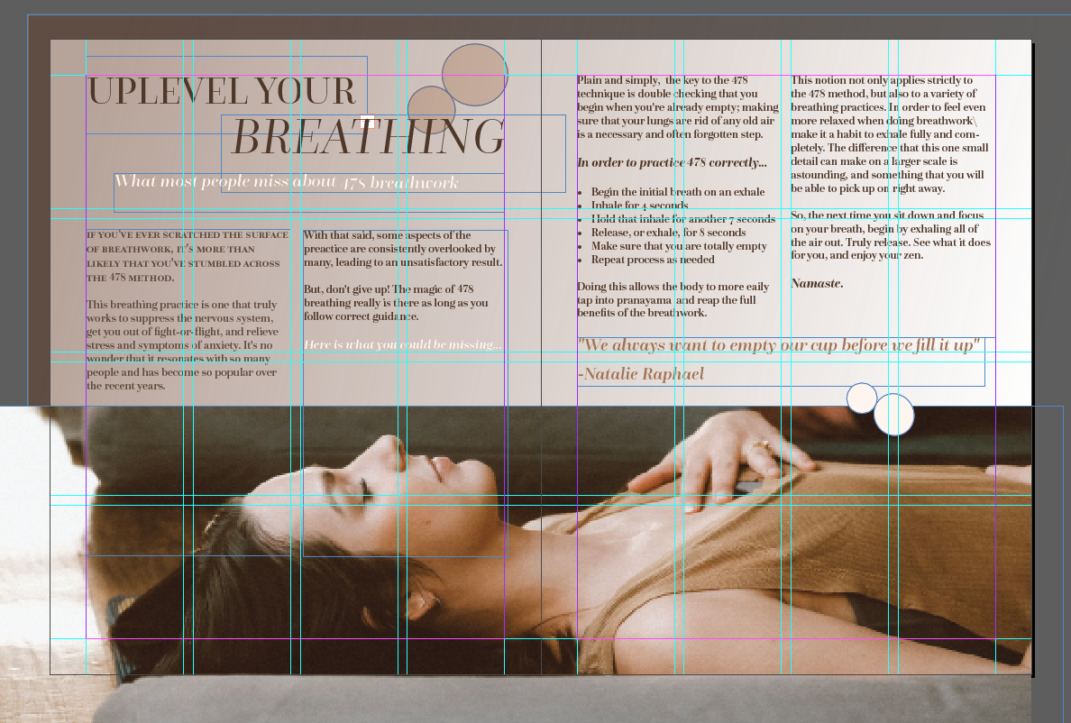
Using a grid to line up text and images on InDesign: