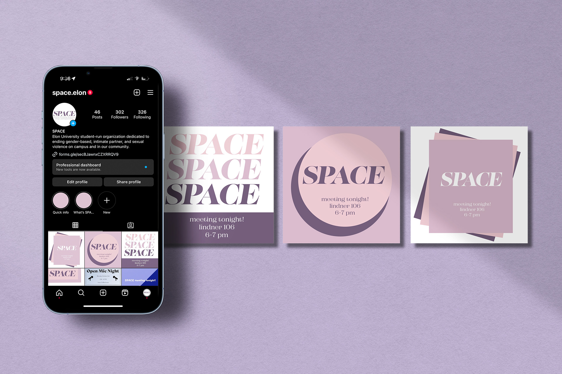
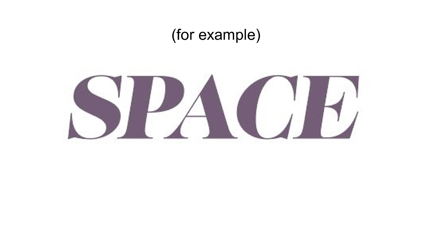
In Spring of 2022, I was given the opportunity to work as the Social Media and Outreach Coordinator for Elon’s SPACE (Students Promoting Awareness, Change, and Empowerment.) In my role, I am responsible for sending out email reminders, and creating bi-weekly Instragram posts that promote our meetings. Going into this position, I had some ideas involving switching the aesthetic of the instagram account to more properly adhere to the goals of the club. Prior to the changes I made, the aesthetic of the club involved a lot of outer space imagery, with the logo looking a bit dated and confusing. This ultimately led to a great deal of confusion on the part of students who thought the club was genuinely an outer space club of sorts. Because of this, I made changes in order to shift the semi-otics of the posts and logo towards something that was more representative of the true values of the club; to provide a safe space for people to discuss their experiences with, and learn more about, sexual assault and gender-based violence.
I came up with a branding deck to present during our executive meeting, and built a new aesthetic based off of the feedback I received. I wanted the color scheme to involve purple, since it’s known to be the color of sexual assault awareness, and I aimed to create a more minimal and simple yet pleasing and appropriate aesthetic.
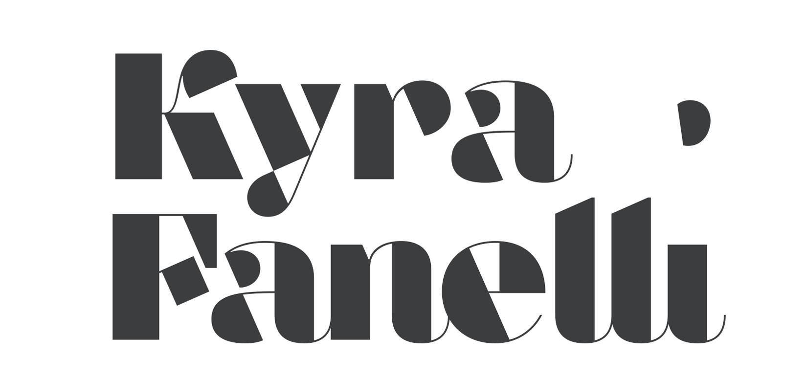
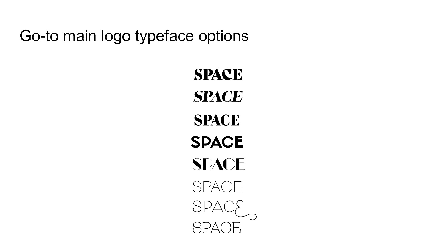
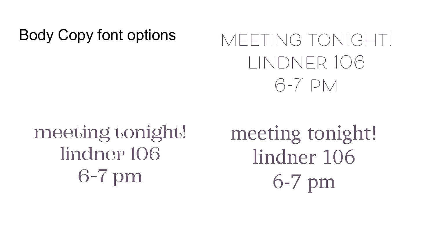
Here, you can see my thought process for the re-brand and new logo design, as well as examples of additional designs and posts that I made for the club.

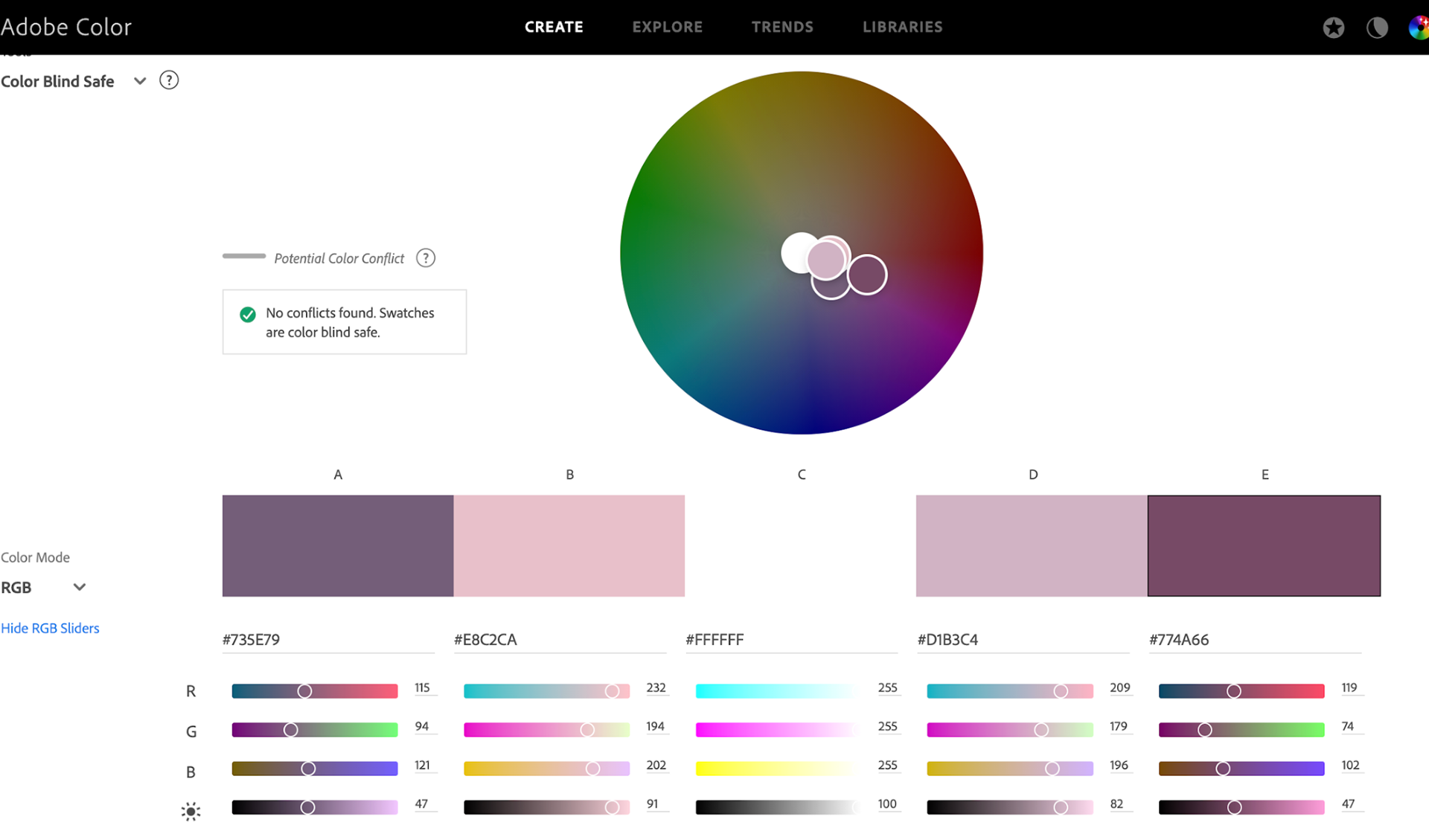
The branding deck I presented during our meeting:

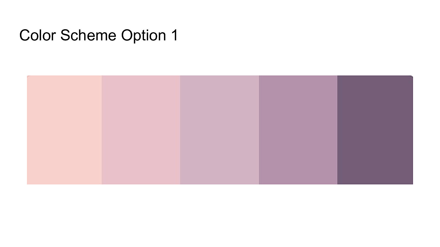
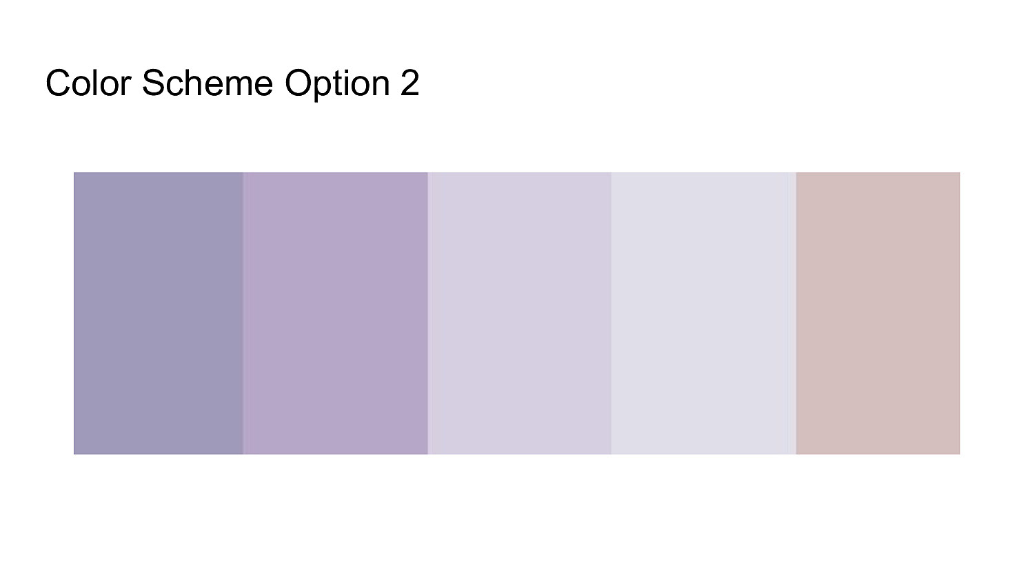

(ensuring color blind safety and accessibility within our decided color palette)
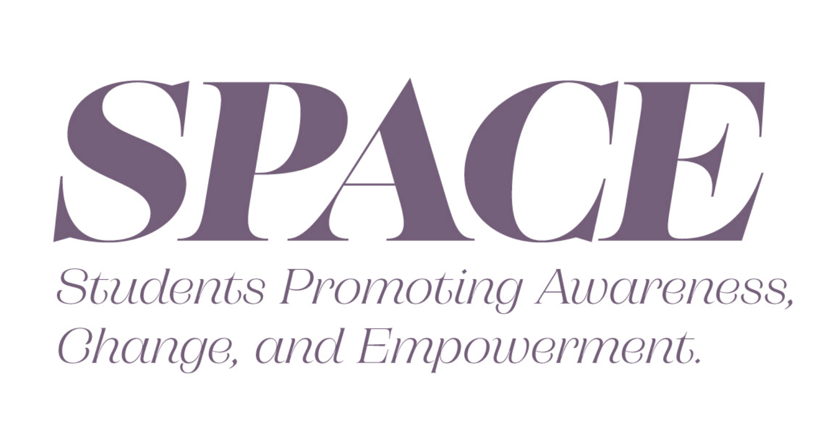
Finalized logo: